- 2
- 22 Mar ’11
Share!
Anatomy of a logo
This is a job I worked on at the turn of the year. It’s the most recent logo I’ve worked on so whilst it’s fresh in the memory I thought I’d do a little review of the process involved in getting to the final version. A little glimpse inside my working process, for those of you who are interested. The name is a rebrand of the clients original name. The logo and new name are not in full use yet, so I can’t name the client until they are. What I can say though, is that it is an organisation that deals with education for blind children. So thats the context of the logo.
Also, just to clarify, I didn’t have anything to do with the name change process, just the brand identity itself. There were about 20 alternative approaches explored before I arrived at the path I’m now going to illustrate, some good, some bad but int he interest of focus I’m not going to leave them out of this post. (If anyone wants to see them drop me a line in the comments below and I’ll update this post with a few of the good and a few of the cringeworthy and my thoughts on each).
So here goes, the birth of a logo brought to you through the wonderful mediums of word and image.
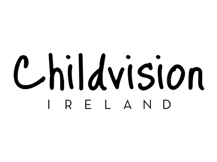
I knew I wanted to use quite a simple font for the main title and after quite a number of rejected fonts, for example the one above, I ended up settling on….
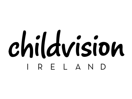
this font, by the name of Romy, did a little tweaking with the spacing of the letters and the angles of the ascenders and descenders and I was pretty happy to continue…
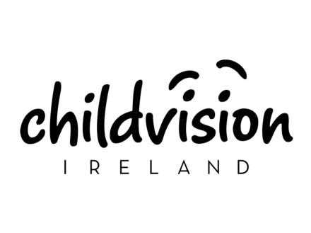
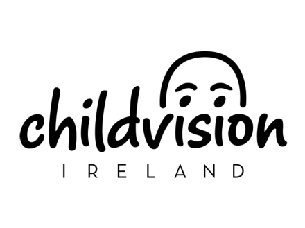
This is where the concept began to form, using the dots over the i's to create the symbolism within the logo but it was much too cartoony here.
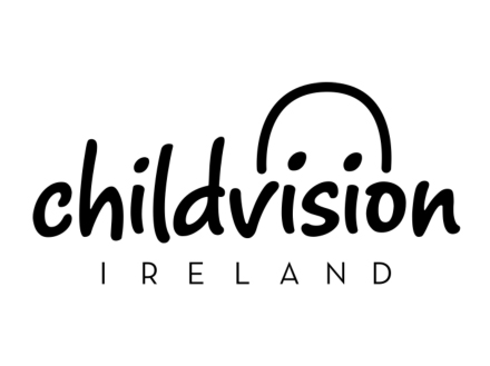
So I got rid of the eyebrows and started to work on the shape of the head, I was conscious of trying to capture the youth of the subject, unfortunately at this stage it was just looking like a skinhead peering over a wall.
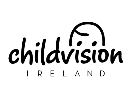
So out go the eyebrows again in favour of a little hair lick to represent the youth of the character, getting closer
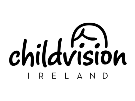
I felt the individual hair lick was a little too simple and made the character look like a baby rather than a child. so I used the side parting which is common in both boys and girls to keep the young feel and try to maintain androgyny. There was something still annoying me about the eyes but I couldn't quite put my finger on it until….

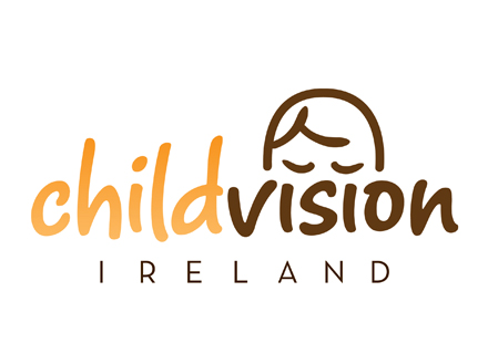
I realised the eyes should be shut, the word says vision so the image should say lack of vision, that is the issue they deal with after all. The golden rule, never show what you say and never say what you show. This went on the become the final approved logo.
I’m really happy with the final logo, especially the decision to shut the eyes, it brings the logo and the concept to life in a much more compelling way. As always any comments, positive or negative, constructive or destructive are most welcome.
-
http://www.facebook.com/djamar.junior Djamar Junior
-
Anonymous
